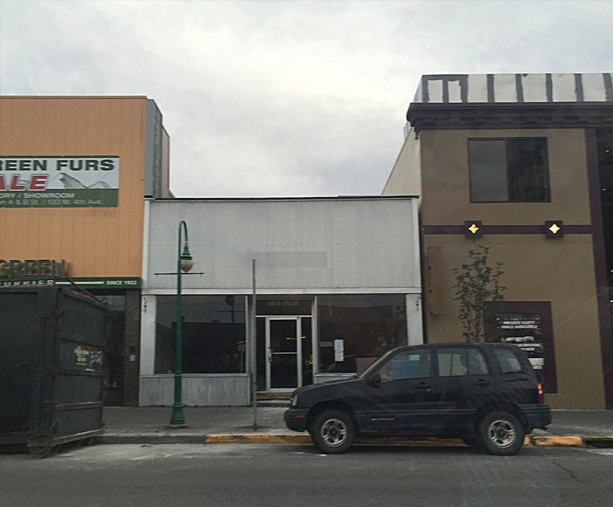
hen Jon McNeil and Nicole Cusack decided to bring a ramen restaurant to Anchorage, they pictured a small, cozy place where they could share their love of phenomenal food and high-level craft cocktails. Instead, they fell in love with a historic three-story, 6,000-square-foot building downtown that provided more than enough room for a growing restaurant—but also enough design challenges to match the space.
Now one of Anchorage’s hot spots with a two-month or more waiting list, Whisky & Ramen was a labor of love that McNeil, a dentist, and Cusack, a lawyer, can look back on with pride. But renovating the space took a lot of effort as well as innovative design solutions.
“We had no idea how big it was when we first saw it; it was just a great old concrete building that had a ton of history, including surviving the 1964 earthquake,” says McNeil. “Instead of seeing it destroyed like a lot of old buildings are, we decided to buy it so it didn’t get wasted.”
Once they started exploring their new purchase, the couple realized that much of its unique architecture had been hidden by older finishes. While the front part of the building had been built more than a century ago, the back part of the building had been added in the ‘60s. In its many iterations, it has served as a photo studio for famed Alaska painter Sydney Laurence, the home of Stoltz Electric Co., an antique store, and later a mercantile.
FabrikaPhoto | envato
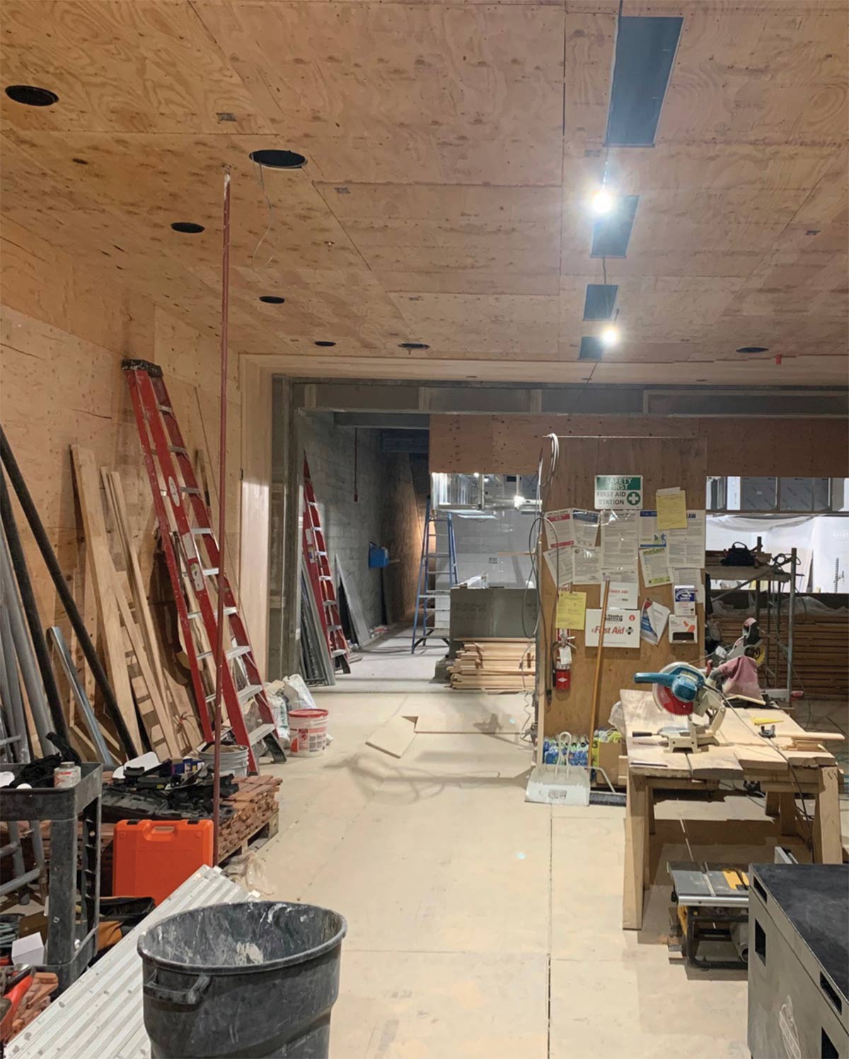
It took them a couple of years to strip the building, in part because the entire façade had to be seismically upgraded to meet modern earthquake codes. Steel beams were installed behind the brick façade, which was reattached to the original concrete back of the building that was already up to code.
“While most historical buildings are grandfathered in, because we went from mercantile use to restaurant use, our project fell under current codes, which made the renovation even more difficult,” says McNeil, adding that, in addition to meeting municipal codes, the entire building is now ADA-compliant.
Because a lot of the building is below grade, the renovation had to utilize the existing sewer line and plumbing lines, incorporating their path into the design of the restaurant. McNeil and Cusack were also able to maintain the original elevator shaft and expand it, though at one point that meant hand-digging to get it to the right depth.
“One of the biggest challenges in the renovation is that every inch counted. For example, when we worked on the bathrooms downstairs, it was originally framed three inches in the wrong direction, which threw off the entire layout,” says Cusack. “We ended up flip-flopping the men’s and women’s rooms.”
In addition to keeping the concrete shell, the couple was also able to reuse the brick in the building. However, that commitment to sustainability involved spending an entire summer cleaning the concrete. “It was definitely a labor of love,” says McNeil.
Because the original building had not been designed to house a restaurant, the renovation involved more specific issues to comply with health standards and increased efficiency.
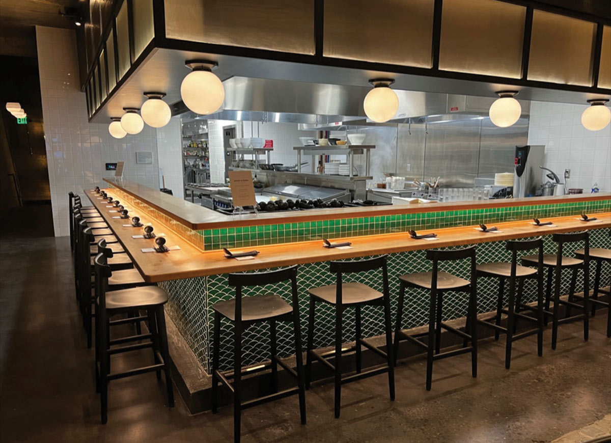
“One of the hardest challenges was figuring out how to get the food out; we use custom-made carts with huge rubber wheels, and these had to be able to roll over the transition at the elevator without jostling the food,” says Cusack. “We also had to get the bar and bar seating to work so that servers could get the carts out of the elevator and through the bar into the dining room. What we’ve got is quirky, but it works.”
The carts are a key part of the restaurant’s operations. “Keeping the elevator was a good pivot for us. It’s not only more efficient but adds to the safety factor because servers are able to roll bowls of soup to the tables instead of carrying them,” she adds.
The couple also decided to put heat in the floors, which meant upgrading a boiler from the ‘70s that was working at about 50 percent efficiency.
“We use a lot of electrical appliances and equipment because we make everything from scratch,” says McNeil. “So we decided to go with a turbine-based system that uses natural gas to produce all of our electricity and also puts off heat that is recycled back into the floors and to heat water.”
The 65-kW microturbine CHP system (combined heat and power), which cost $237,000, runs at 80 percent efficiency and will pay for itself in roughly four years. Edwards Construction Group of Ridgefield, Washington installed the microturbine on the restaurant’s roof with equipment distributor Arctic Energy overseeing the technical aspects.
“In addition to figuring out a way to work with the existing concrete structure, we needed to find a way to make the building accessible, to get it to flow, and to create a restaurant in there,” says Clift. The design puts kitchens on the middle and lower levels, as well as office and employee space on the third floor.
DCI Engineers was brought in to analyze the building and come up with shoring solutions, which included creating new beams and supports to reinforce existing openings and the elevator shaft. Finding space for the sprinkler system, as well as designing ways to fit air ducts into the walls discreetly, were added concerns in the design.

The couple’s goal to add contemporary finishes meant sourcing unique high-end materials, including clear birch wood, specially designed wallpaper, and historic brick.
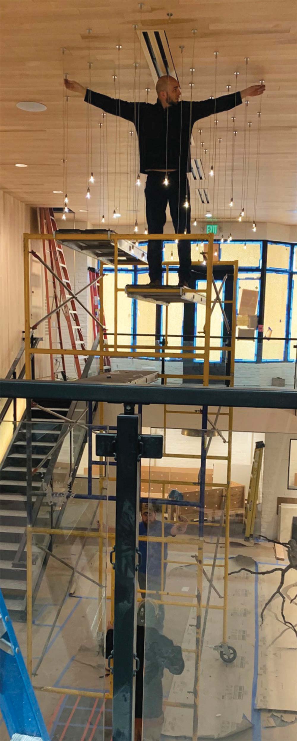
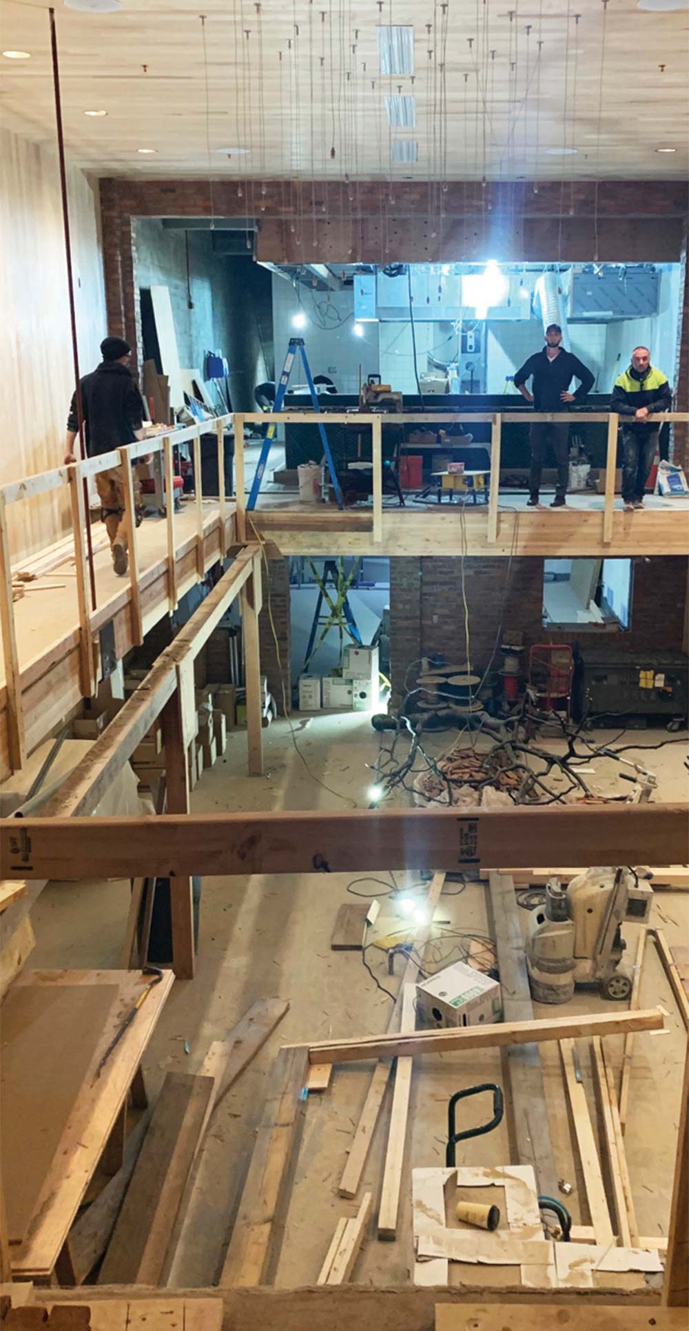
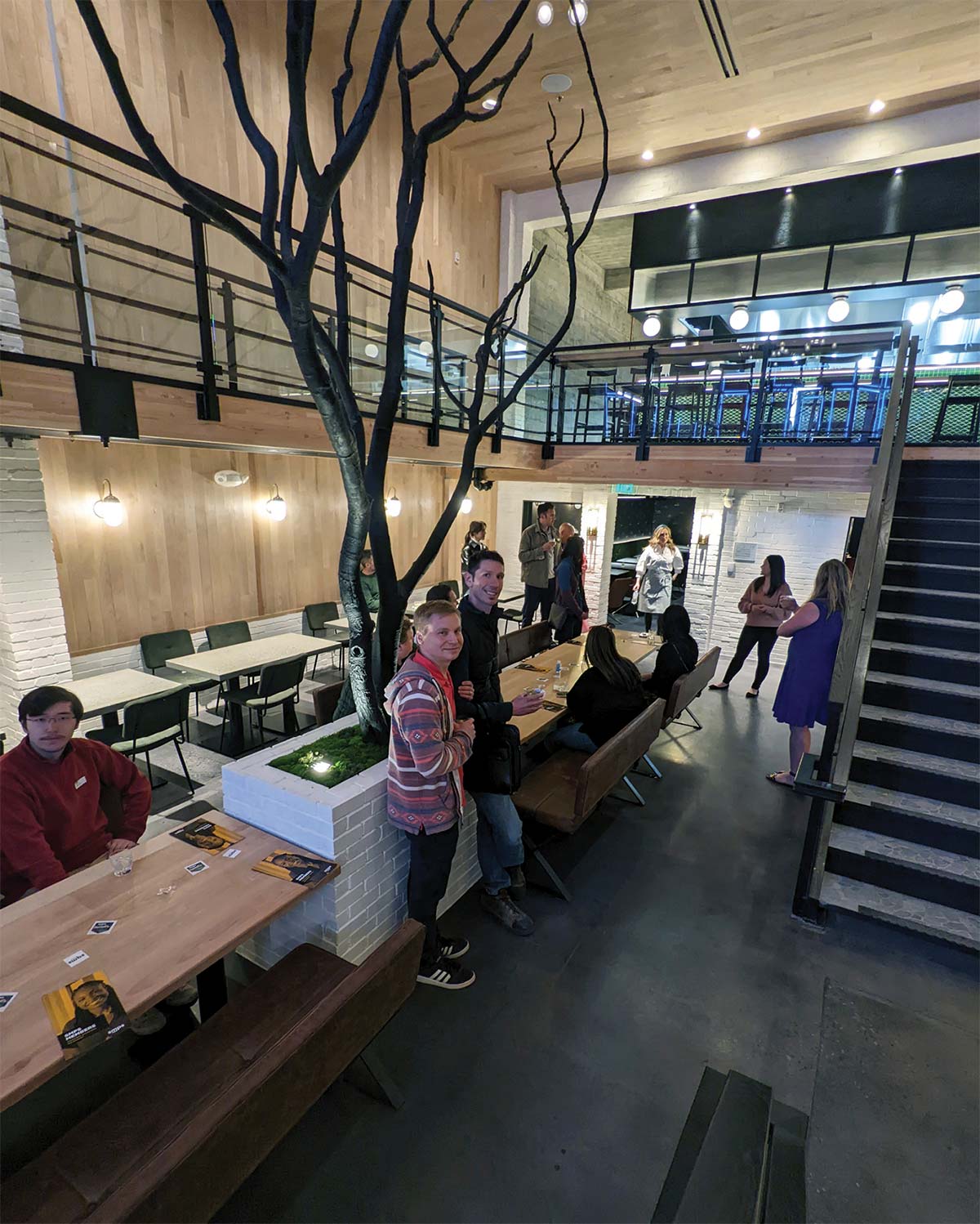
One of the more fun elements is the tree in the middle of the floor that not only serves as a focal point but symbolizes the Alaska/Japanese/Nordic style that the couple envisioned.
“The tree is from Alaska, but we used a traditional Japanese technique to burn it with oil to harden it,” says Cusack. “We did it in the yard and brought it through before the doors were on the front; our contractors were super annoyed with us because then they had to build around the tree.”

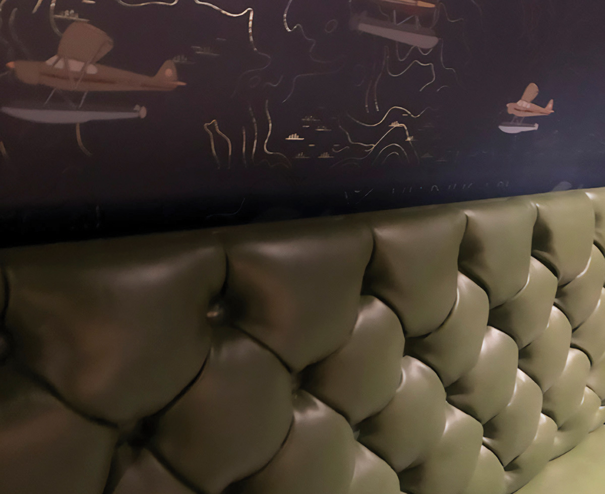

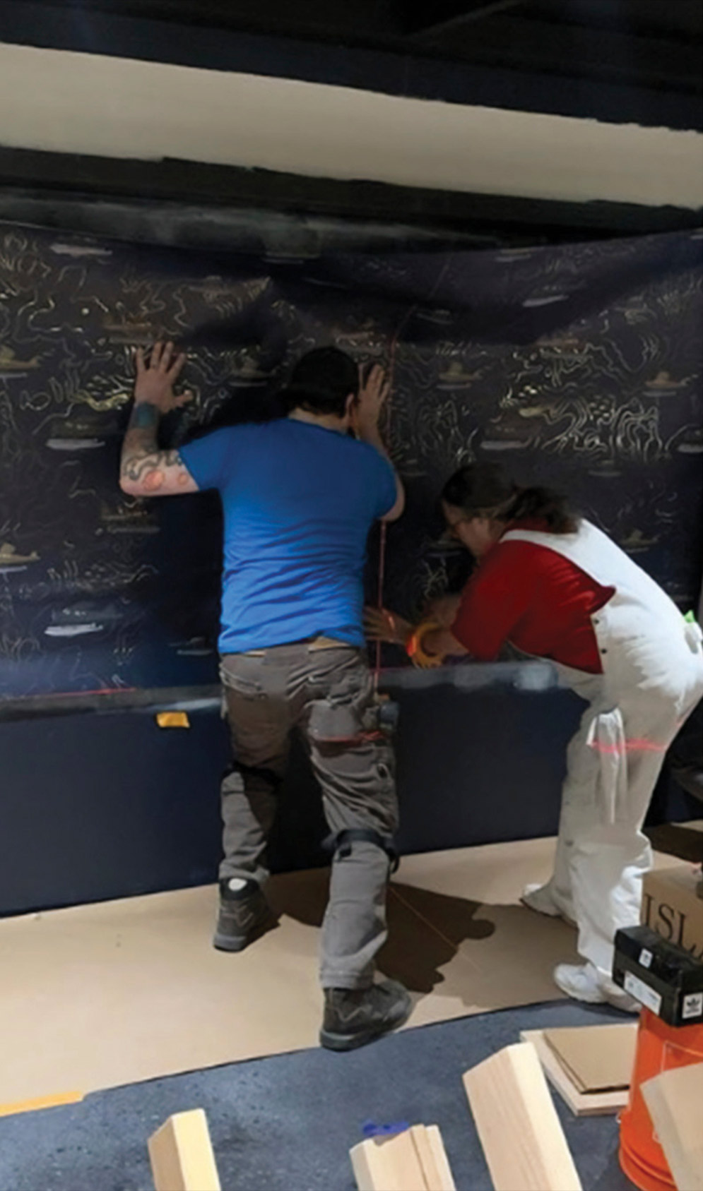
Ben Campbell of Campbell Painting & Drywall installed the wallpaper after finishing the drywall work and priming and painting the exposed brick. He spent about six months on the project, working on different phases as the design came to fruition.
“Some of the wallpaper was custom-designed and some was imported from overseas, so we took our sweet, sweet time. If you mess up, it’s hard to get extra,” he says with a laugh.
“The leather was very thick and hard to work with, and I spent nights awake thinking, ‘How are we going to do this?” says owner Hermilo Lugo. “We had to keep playing with the leather and soak it at night to soften it up so we could create the beautiful diamond patterns that Nicole wanted.”
Kristy Knutson, business manager for Lugo’s Upholstery, says of Cusack, “She definitely had a vision in her mind, and everything in the restaurant shows her specific touch, from the artist-designed wallpaper to the seats made of green tufted leather and Scottish wool.”
The upholsterers had to work around the brick columns and concrete structure to make everything fit, and Lugo says that they poured their heart and soul into creating a stunning space.
“We worked on it day and night, seven days a week, twelve hours a day,” says Lugo, “and it turned out beautifully. We’re really proud of our work.”
Josh Lowman
Josh Lowman
“People have been very responsive and kind about Whisky & Ramen; there’s a real excitement and energy about it,” says Cusack. “That’s been super rewarding for us. When you build something, you hope people appreciate it, but they really get it. They see every detail, every inch that we were painstakingly focused on.”
“We were burnt out at the finish line, so it’s wonderful that the response has been so overwhelmingly positive,” McNeil adds, noting that the restaurant grew from zero to forty employees within two months. “You don’t realize how hard it is to get a restaurant and bar with high-level craft cocktails up and running. Restaurants in general have a lot of demands, and then add to this the cost of renovating a historic building in Anchorage.”
McNeil laughs as he reflects on the scope of the project. “We’re very happy with the final product,” he says, “but starting from our original idea of just creating a small ramen shop—it kind of snowballed.”![]()