hen designing on a grand scale, there are a lot of factors to consider, ranging from the amount of work required to the “canvas” itself and the reactions of the many people who are going to see the mural, project, or installation.
“The beautiful thing about public art is that it is shared with everyone,” explains Crystal Worl, who co-owns indigenous design firm Trickster Company along with her brother, Rico. “You’re not creating one painting that will be sold to one individual for just that person to see but something that everyone can enjoy.”
“When you think of designing for the general public, you have to imagine all of the people who are going to see it,” says Edmond Huot, chief creative officer of Forward Media. “That means being aware of cultural sensitivities, colors, symbology, and icons, among other things. Regardless of what you might like subjectively, your design needs to resonate with the audience.”
Crystal Worl
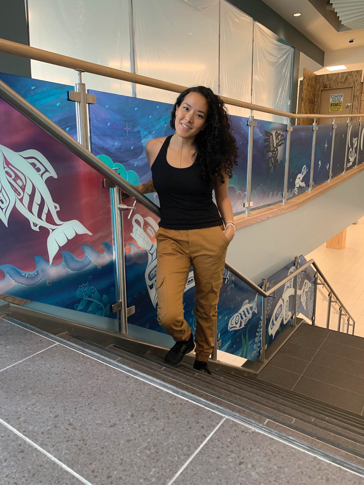
Crystal Worl
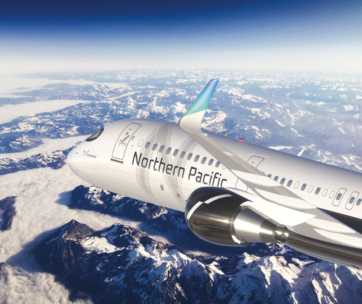
“The client gave us a blank slate, including coming up with a name as well as the brand identity, livery, and marketing; it was an awesome opportunity,” says Huot, “but we needed to take great care in the design, with an understanding of the cultural significance of Alaska and its indigenous people as well as what people in Asia think of various colors and symbols.”
The livery design also had to look correct when painted on a 155-foot canvas of aircraft aluminum. “Unlike a magazine ad, you’re working on a large, cylindrically shaped object, and you have to understand the dimensionality of an aircraft,” Huot says. “You need to appreciate how lines and stripes and colors will sit on a curved shape and different types of metal. It is an exceptional backdrop.”
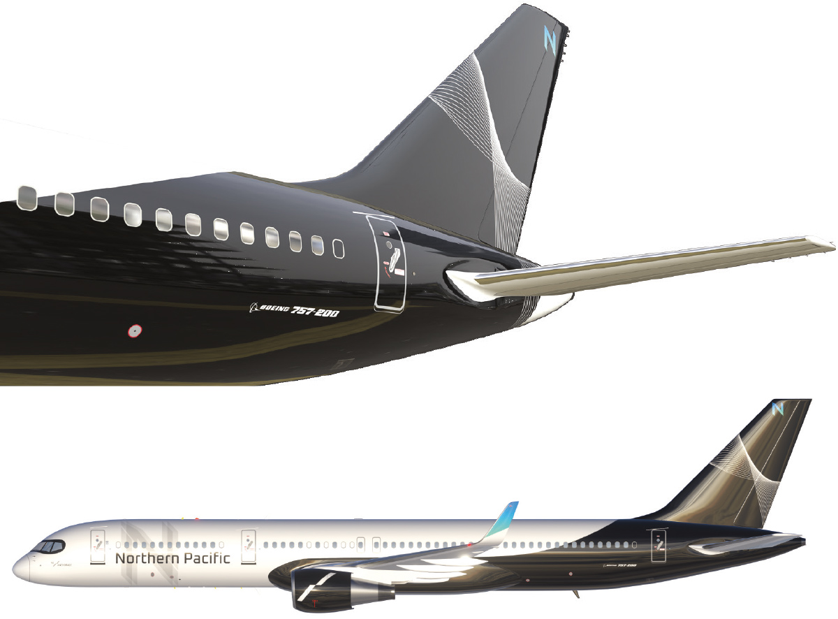
The design itself is black and white, which Huot says speaks to Alaska’s natural elements including snow, mountains, rocks, and ice. A line motif races across the fin of the tail.
“This very abstract graphic speaks to air movement and ascension,” says Huot. “We wanted to keep it quite abstract so that people looking at it could make their own judgements.”
The livery also makes a statement about the nature of the company. “Even though Northern Pacific is a low-cost carrier, we wanted it to be simple and elegant to let people know that they would still get a premium experience,” he adds. “This is especially important from an Asian perspective, as those customers take a slightly more conservative view when looking at their options.”
Once Forward Media was ready to show the client, Huot’s team had a CAD (computer-aided design) mockup of an airplane featuring the design.
“The mockup needs to look so realistic that it blows the client away, and fortunately they all loved it,” says Huot. He adds that he still gets excited seeing his concepts come to fruition: “There’s nothing like walking into a hangar nervously to see the first plane painted; it’s just awe inspiring.”
Forward Media | Northern Pacific Airways
Forward Media | Northern Pacific Airways
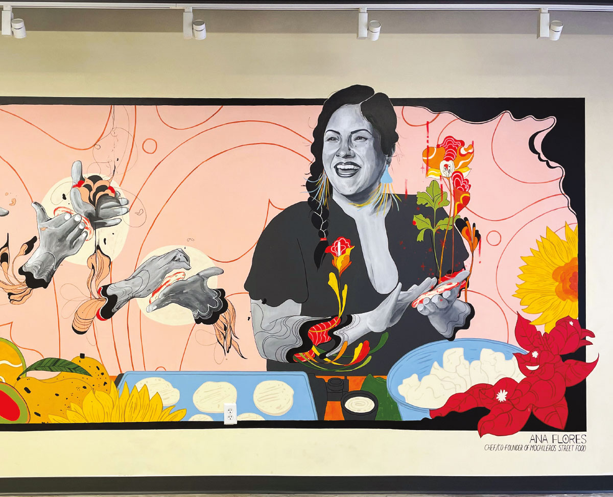
“What I love about what I do is that it’s different for every project,” she says. “There’s a lot of thinking on the spot—you’ll visit a space you’ve only seen in pictures and see that there are holes in the walls or outlets or that the ground isn’t even. You have to work within the structure and the dimensions you’re given and work around obstacles or even the wall material.”
Outdoor projects sometimes change with the seasons. “One wall I was working on during a rainy summer grew moss, and I had to clean that out,” she says.
Armamento uses different methods to transfer a design to a wall, including a doodle grid, projection, or even drawing freehand. She draws with chalk or pencil, and once the sketch is complete, she labels it with colors and other information and paints it with top-quality acrylic house paint.
“It’s pretty much large-scale paint-by-numbers, in a way,” she says.
While she enjoys the challenge of working on such a large canvas, she says what’s more important is the message in the design.
“What’s amazing about this sort of medium is that it can reflect the voice of the community or even the voices of people visiting,” she says. “That’s why it’s so important to have representation and diversity in the artwork—to have more voices. If you see my work, that’s my goal and my bottom line; to push marginalized people’s voices that have not been heard into the forefront and to celebrate different people’s joys.”
“I’d never done anything of this scale, so there was a lot of ‘new’ for me,” says Worl, who also served as the project manager. “It took three years; it was postponed because of COVID, and then we were delayed by a storm in Texas where the paint and adhesive were manufactured. The elements were against me, but I was persistent.”
Worl says that it helped that she was able to reach out to the community for assistance and input and that she values the collaboration that comes with such a momentous project.
“I engage with various community members depending on the theme of the work,” she says of her process. “For the Elizabeth Peratrovich mural, for example, I was very involved with my fellow clan members of the Lukaax.ádi [Raven/Sockeye Clan] as well as the greater Juneau community. It was one of the most rewarding parts of doing this project.”
Worl scanned her sketches into Adobe Illustrator and hired a company in Philadelphia to print the design on mural cloth. “With the help of five apprentices, we then painted each panel, section by section, to make a mixed media mural, and then a new crew of apprentices glued each square of mural cloth to the wall,” Worl explains. “It was a very messy process, but I learned to operate a lift, and that was super cool.”
To apply the sealant, the weather in Juneau needed to stay dry and above 50°F, which added to Worl’s stress.
“Crying was just part of the process,” she says. “The mural holds my blood, sweat, and tears, and I’m just super proud of getting it done.”
Worl is currently working on a mural in Anchorage that will feature the diversity of its many cultures, and she and her brother are also working on a project at the Juneau International Airport that represents the variety of animal life in Southeast.
“It’s a very cool way of storytelling; visitors will walk through the landscape seeing the animals and sea life that I’ve observed on my hunting and fishing expeditions with my family, and animals that represent our identity as Tlingit people,” she explains.
“Rico is a genius when it comes to technology, computers, and graphic design, so he’s helping me take it to the next level with a vector design that looked like the texture of a painting,” she adds.
Rejoy Armamento
Rejoy Armamento
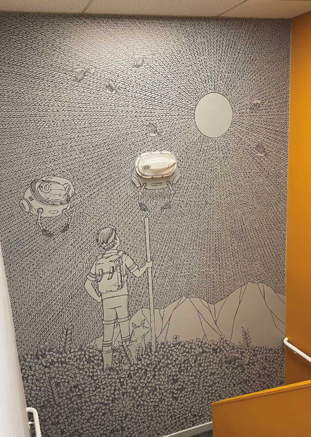
Kim has worked on murals for The Launch Company’s warehouse in Anchorage, the Anchorage Museum, Anchorage City Hall, and the Snow City Café, among others. “They all asked me to do murals, so I jumped in; the rest is history,” he says. “Since then, I’ve worked on so many mural projects, I rarely draw on paper anymore.”
Kim appreciates the difficulty of translating his art, which is very detailed, to much larger spaces.
“Large spaces tend to offer a completely different layout than what I’m drawing,” he says. “Mural spaces also tend to be in all kinds of odd structures, like a room with a big beam going down the middle of it. It does affect what I draw, so I’m always trying to figure out how my art and techniques, and the things I’m used to doing, can be applied to such a large space.”
He adds, “It gets tricky sometimes, but so far, I’ve figured out ways to get around obstacles.”
Working in the SEED Lab [Solutions for Energy and Equity through Design] for the Anchorage Museum, for example, Kim had to figure out how to work on a wall that wasn’t flat as well as find a way around a protruding heater.
“It was really fun to draw right over it all,” he says. “The different angles mixed with the intricacy of my style made it really playful, and it was fun to see my art covering everything. All of the little obstacles actually add to the piece itself.”
While Kim is used to drawing quickly on a large scale, painting bigger pieces increases the level of difficulty.
“Painting is new to me, and it’s a much slower process,” he said. “I feel like I can draw on a large scale just as fast as I can on a piece of paper.
“Doing these larger pieces is also more physically challenging—you’re on ladders, going up and down, getting in awkward positions,” he says. “When I do murals, I don’t get much sleep—I go as long as I can straight through. When a mural is done and I’m looking at it, sometimes I can’t believe I’ve just done that. I’m almost not there for the process of it.”
Tim Kim
Tim Kim
“It differentiates a business’ branding from everyone else,” says Armamento. “When you see something like that on the walls of a business, it makes you appreciate that they’ve paid so much attention to detail and it shows their personality, too. It can also make you feel a certain way—whether that’s fun or elegant.”
Commissioning such works has another benefit. “Businesses who hire local artists are also supporting the community,” Armamento adds. “It goes full circle; you’re involving the artist and the people who live there in your business. For an artist it’s good, because it’s a way to market their work. The relationship is reciprocal.”
While some clients know exactly what they want, others may rely on the artist to figure out what will fit a space best.
“The goal is to create something that fits their vision; they have an end goal, but they need me to realize it,” says Armamento. “It boils down to creating a lot of visuals, having a lot of communication, and making sure we’re on the same page.”
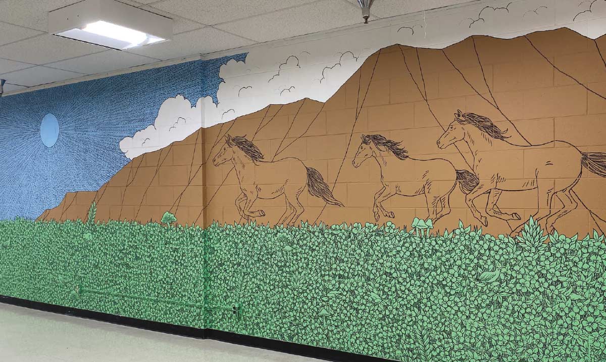
Kim, who usually works in black and white, recently worked on a mural for Birchwood ABC Elementary school, which gave him a chance to expand his aesthetic.
“They wanted color, so I incorporated paint in very minimal colors,” he says. “It was exciting to jump into different ideas and approaches. After I did that, Alaska Pacific University asked me to do a mural in their cafeteria. They wanted color, too, so I did something similar to what I’d done at Birchwood.”
Even as these designs showcase an artists’ talents, they may also reveal more of the artists themselves.
“When you do art like this, you put yourself out there; you become very vulnerable because now you’re a public person and people see your art from all over,” says Worl. “There’s risk in being this exposed, and for me, being a person who normally hides in the studio, this is both uncomfortable and exciting.
“I try to channel that fear as excitement,” she adds. “These projects have brought me the blessing of getting to meet people from all over and all walks of life.” ![]()